Colours in movie posters since 1914

Edit: Buy the movie poster hues (1914-2012) poster

A couple of weeks ago, I was having brunch with Kim-Mai Cutler — we were discussing the new startup I’m building in the enterprise space (if you’re a ui/ux person or awesome engineer looking for something fun to do, drop me a line!) — and I mentioned how I felt that most movie posters these days were very blue and dark. She didn’t fully believe me and challenged me to prove it. I looked around, and found some people had done this with a few posters over the last few years, but I became curious about the longer-term trends and what they would show. So, as any engineer would do, I wrote some code! (The code is open source and lives on github: image analysis.)

Edit: this post is up on Flowing Data, an awesome data visualization blog, YC Hacker news!, and Gizmodo. I will be doing a follow-on post with much better analysis and much more data. Follow @vijayp on twitter and stay tuned!

Visualizations:

The number of posters I was able to get varied based on the year:

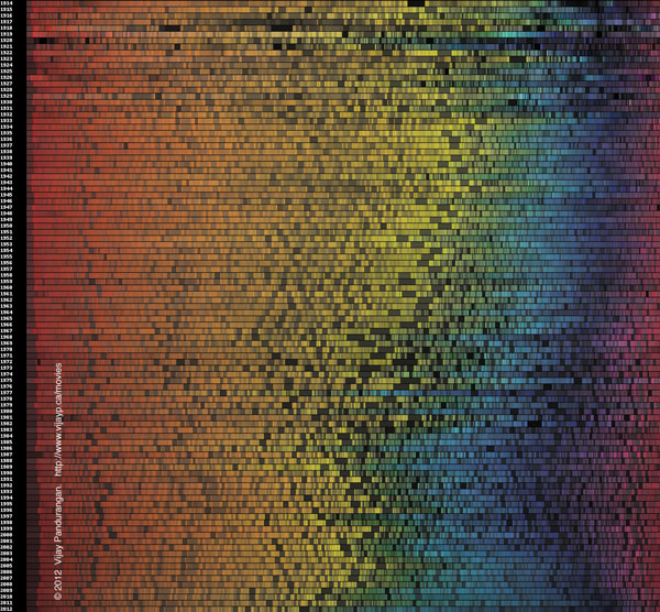
I first made a unified view of colour trends in movie posters since 1914. Ignoring black and white colours, I generated a horizontal strip of hues in HSL. The width of each hue represents the amount of that hue across all images for that year, and the saturation and lighting were the weighted average for all matching pixels. Since HSL has a fixed order, comparisons can be made between years visually. (You can buy the movie poster hues poster here.) Click on the image below for a more detailed view:
 

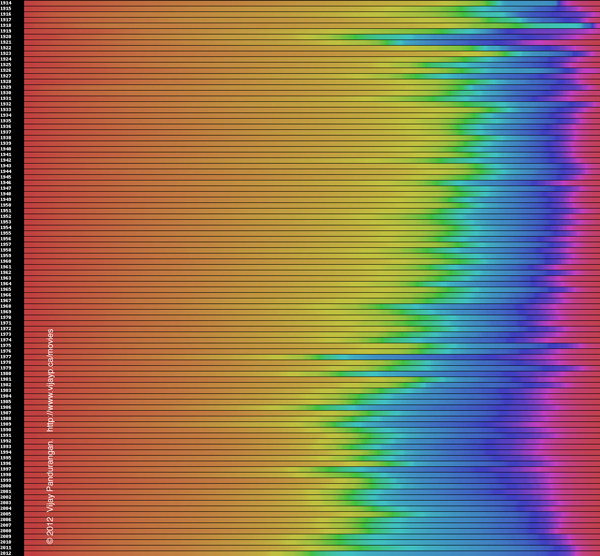
Next, I made a similar unified view of  generic colour trends in movie posters since 1914, but here lightness and saturation are both ignored. This makes the distribution of hues much more clear, but hides the average “darkness” of the photos.
 

Finally, I have created a pie chart representing the colour distribution of a specific year’s movie posters. (This should probably be animated and a line graph, more on that in the future work section)

Rationale:

First off, it is true that movie posters are much more blue, and much less orange than they used to be. QED 🙂 This page also talks about the blue/orange colours in movies.

This does appears to be a steady trend since 1915. Could this be related to evolution in the physical process of poster printing; what’s the effect of the economics and difficulty of producing posters over time? I also wonder whether moviemakers have become better at figuring out the “optimal” colour distribution of posters over time, and whether we’re asymptotically approaching some quiescent distribution.

I was a bit concerned that some of this might be due to bias in the data: some movies would be over-represented in the intra-year average (remember that some movies have multiple posters and I normalize over posters, not movies). I think this is not actually a huge issue because it’s reasonable to assume that a movie’s marketing budget is roughly proportional to the number of posters that it has produced for itself. This means that the skew, if any, would be similar to the perceived average.

I presented these preliminary data to some friends of mine who are more steeped in the world of graphics and arts. Cheryle Cranbourne, (she used to be a graphics designer and has just finished a Masters in interior architecture at RISD) had a number of good thoughts:

[Edit: I had misquoted this earlier] The movies whose posters I analysed “cover a good range of genres. Perhaps the colors say less about how movie posters’ colors as a whole and color trends, than they do about how genres of movies have evolved. For example, there are more action/thriller/sci-fi [films] than there were 50-70 years ago, which might have something to do with the increase in darker, more ‘masculine’ shades.”

This is backed up a bit by data from under consideration’s look at movie posters. They didn’t go back very far, but there did seem to be a reasonable correlation between movie age rating and palette.

She also pointed out that earlier posters were all illustrated/ hand painted, with fewer colors and less variation in tone. Perhaps the fact that white and black have become more prevalent is due to the change from illustration to photography. Painted skin might also over-represent orange and under-represent other hues that happen in real life.

Methodology:

I downloaded ~ 35k thumbnailed-size images (yay wget — “The Social Network” inspired me to not use curl) from a site that has a lot of movie posters online. I then grouped the movie posters by the year in which the movie they promoted was released. For each year, I counted the total number of pixels for each colour in the year. After normalizing and converting to HSL coordinates, I generated the above visualizations.

Inspirations:

I was inspired by Tyler Neylon’s great work on colour visualizations. I ended up writing my own code to do these image analysis visualizations, but I will try to integrate it with his work.

Future work:

There’s a bunch of stuff I still have to / want to do, but since I’m working on my startup, I don’t really have much time to focus on it right now. Here’s a long list of stuff:

  1. Follow up on all the open questions about the reasons for this change.
  2. Use other metadata (not just year) for movies to search for patterns. A simple machine learning algorithm should suffice if I throw all the attributes in at once. This should be able to highlight whether genre is important, and what other factors are crucial
  3. “main colour” analysis. I should run some kind of clustering (as Tyler does in his code). His code uses a handwritten (?) k-means clustering algorithm, which is a bit slow when faced with thousands of pictures worth of data. There are some faster albeit slightly less accurate versions that I could use.
  4. I need to move the pie charts to use gcharts js api, so they’re interactive
  5. I should probably make nicer/fancier js onhover stuff
  6. I should look at Bollywood and other sources to see whether this holds across countries.
  7. My visualizations and javascript aren’t so good. I have to learn how to do this stuff better!

Posted

in

, ,

by

Tags:

Comments

86 responses to “Colours in movie posters since 1914”

  1. Theranthrope Avatar
    Theranthrope

    I’d be more interesting to go into some more fine-toothed datasets: sort by studio, or academy award winners, or box office hits or flops, or by genre or sub-genre, or by nationality such as Hollywood vs Bollywood, or even before and after specific revolutionary films such as Sci-fi before-and-after Star Wars or CG animated movies before-and-after Toy Story.

    Much hay could be made of this.

  2. […] Pandurangan gives us a breakdown of colors used in movie posters by the year beginning in 1914.  Visit the site to get the specifics year to […]

  3. […] you can see in the image below, 1924 is missing, which Pandurangan says on his blog was an error in the visualization‘s […]

  4. […] you can see in the image below, 1924 is missing, which Pandurangan says on his blog was an error in the visualization’… Continue […]

  5. […] you can see in the image below, 1924 is missing, which Pandurangan says on his blog was an error in the visualization’s […]

  6. vijayp Avatar

    I fixed the 1924 bug, finally 🙂

  7. […] After downloading 35,000 posters and sorting them by year, he crunched to numbers to produce this image, which shows the color trends over time. The most obvious change we can see is an overall increase […]

  8. […] you can see in the image below, 1924 is missing, which Pandurangan says on his blog was an error in the visualization’… Continue […]

  9. Liam Lenten Avatar
    Liam Lenten

    Vijay, are you able to split each strip into pie charts of the seven pure spectral colors? I have a time-series modelling technique that might shed some light (pardon the pun) on the trends in the economics of the industry.

  10. […] Eine ziemlich beeindruckende Infografik von Vijay Pandurangan: Dargestellt wird die Farbverteilung von Filmplakaten von 1914 bis 2012, anhand der Anzahl der jeweiligen Pixel eines Posters. Das Ergebnis: Die Plakate heutiger Filme sind im Schnitt weitaus dunkler, kälter und blaustichiger. Mehr Matrix und The Dark Knight, weniger Zauberer von Oz und Grease. Beeindruckende 35.000 Movie-Artworks wurden für diese Statistik herangezogen und die statistische Entwicklung ist dabei überraschend signifikant. Weitere Infos auf  Pandurangans Blog: […]

  11. […] by Vijay Pandurangan because he needed to prove a friend wrong who didn’t believe him when he “mentioned how […]

  12. Tor Martin Kristiansen Avatar
    Tor Martin Kristiansen

    This is very nice and interesting. A “fact” that I (and Im sure many others) have noticed about movie posters and/or covers (dvd, vhs, etc), is that if it has a white background and with not much else going on, it will be a “chick flick” (romantic comedy usually). It seems to me to be astoundingly consistent, although I havent done any actual scientific research to prove it and Im sure there must exist exceptions. Im not sure whether to find it annoying, or to be thankful for the heads up so I can stear well clear of those movies.

    Another obvious observation is that posters and covers for children’s movies will often have a lot of bright primary colours.

  13. […] همین اطلاعات رو با ژانر فیلم و اینجور چیزها ترکیب کنه. وبلاگش رو برای توضیح بیشتر و نمودارهای دقیق تر کلیک کنی… به اشتراک بگذارید از مطلب خوشتون اومد؟ بهش مثبت یک […]

  14. […] روش اجرا؟ خوندن پسرها از یک سایت حاوی اطلاعات فیلم ها و بعد طبقه بندی بر اساس سال و بعد در آوردن رنگ و در نهایت کشیدن نمودار. ایده بعدی این آدم اینه که همین اطلاعات رو با ژانر فیلم و اینجور چیزها ترکیب کنه. وبلاگش رو برای توضیح بیشتر و نمودارهای دقیق تر کلیک کنی… […]

  15. allgood2 Avatar

    Great poster and analysis. Actually just a great little project. I find 1919 and 1920 interesting for their seemingly excessive spikes of blue (blue greens, etc) It makes me want to pull the list of films from that period to see what was going on. Just a casual review so far at IMDB, but http://www.imdb.com/year/1919/ and http://www.imdb.com/year/1920/ do seem to have the blue-orange/black-orange dynamic going on.

  16. […] evidenti, come il visibile aumento dei colori freddi, ad aver fatto discutere di più. C’è chi dice che la mancanza del blu sia dovuto al fatto che i colori freddi sbiadiscano prima dei colori caldi, […]

  17. […] and art, ever uneasy bedfellows, meet in eye-pleasingly gradated fashion over at Vijay Pandurangan’s blog, where the engineer hunkered down, scanned the web for data from 1914 to 2012, wrote some computer […]

  18. […] Eine ziemlich beeindruckende Infografik von Vijay Pandurangan: Dargestellt wird die Farbverteilung von Filmplakaten von 1914 bis 2012, anhand der Anzahl der jeweiligen Pixel eines Posters. Das Ergebnis: Die Plakate heutiger Filme sind im Schnitt weitaus dunkler, kälter und blaustichiger. Mehr Matrix und The Dark Knight, weniger Zauberer von Oz und Grease. Beeindruckende 35.000 Movie-Artworks wurden für diese Statistik herangezogen und die statistische Entwicklung ist dabei überraschend signifikant. Weitere Infos auf Pandurangans Blog: […]

  19. […] While we’re looking at the evolution of entertainment, check out this cool graphic made by software engineer Vijay Pandurangan diaplaying the dominant colors in movie posters since 1914. Why did he do this? “I felt that most movie posters these days were very blue and dark. She didn’t fully believe me and challen…“ […]

  20. […] week I came across some fun visualisations by Vijay Pandurangan showing the historical change in movie poster colours. Starting back in 1914 and running through to this year, Vijay collected a stack of movie posters […]

  21. Adam Wulf Avatar

    Really cool to see these trends over time! I also wonder how much pricing of different inks played a role especially in early 1900s. The very end of this article: http://ezinearticles.com/?Early-Indigo-Dyeing-and-Printing-Methods&id=1519705 suggests that synthetic indigo didn’t become commercially viable until the 1920s, which is the first year you see a larger amount of blue in these posters.

    Very interesting, thanks for putting all this together!

  22. […] Colours in movie posters since 1914 « Vijay Pandurangan’s blog. […]

  23. […] Pandurangan writes about his visualization of movie posters since 1914: I first made a unified view of colour trends in movie posters since 1914. Ignoring black and […]

  24. Alex Mihăileanu Avatar

    Here’s a thought. In the last few years, with the global crisis and all, I noticed a “design” trend. It’s more of a psychological factor rather than an aesthetic one. Colors are pretty important in psychology and you all probably know that designers chose to use certain colors for each of their clients depending on their target audience, etc.
    Now, if you look back a hundred years, we’ve went through some rough times and evolved to what we are now. Usually, the colors used during the decades represent a state of mind which defines those times. And you can look back to the jazz-era, the rock-and-roll era, the hippie era, the hard rock era, the pop era, you get the point. They’re pretty much interconnected, and the best example is music plus fashion trends. Look on how they evolved and compare it to your charts and you’ll see it’s pretty much similar.
    Now, your charts are a pretty good definition of how optimistic people were during those specific decades. Believe it or not, the ’30s were probably the most optimistic, right after the Great Depression. Then the ’40, because winning the war meant that a new bright future will arise, then the ’50s with its futurism (we now call it retrofuturism, lol.)
    Then, ’60s were kind of a disappointment, because the future imagined in the ’50s didn’t really happen (google for “American Pie explained”.) You should also check out the ’70s and ’78 and ’79, how things evolved. Correlate this with the hippie movement and all, then the Woodstock, etc. Then look at the ’80s and the ’90s, when evolution meant more corporate jobs and more stress.
    Basically, where there’s lots of orange and yellow, you have optimist years. Where there’s lots of stress, people start to lack optimism and you can see the disappointment in the colors they use. The best example is in the recent few years, just look at your chart and check out the amount of dark colours.
    It’s actually fun to try to observe how stuff evolves. My conclusion is that people need optimism – and a simple demonstration is the fashion industry in the last two or three years, which basically released collections inspired from the ’50s fashion all the way to the ’90s in such a short time.
    Anyway, it’s just a theory.

  25. […] 説明によると、映画サイトからポスターのサムネイルをダウンロードしてデータを可視化したそうです。だんだん青と紫が多くなってきたのは昨今のクールな世相を反映しているのかもしれません。 カテゴリー: ソフトウェア タグ: Movie コメント (0) トラックバック (0) コメントをどうぞ トラックバックURL […]

  26. Pascal Bourguignon Avatar
    Pascal Bourguignon

    My explaination is that red-orange-yellow are earthly colors, while green-blue-violet are spacey colors. I see it as the evolution toward science-fiction and futuristic movies. Therefore, contrary to the previous post, I’d say that the bluer, the more optimistic/futurist the mood. Notice for example the spikes in blue in 1919/1920 (after the WWI, the mood certainly improved), or in 1967 (Apollo 1) or 1976 (Shuttle).

  27. […] Colours in movie posters since 1914 « Vijay Pandurangan’s blog Distribution of colors in movie posters from 1914-2012 […]

  28. Desiree Avatar
    Desiree

    Wondering if there’s more greys/browns/drab tones during economic/cultural downturn…

  29. […] While we’re looking at the evolution of entertainment, check out this cool graphic made by software engineer Vijay Pandurangan diaplaying the dominant colors in movie posters since 1914. Why did he do this? “I felt that most movie posters these days were very blue and dark. She didn’t fully believe me and challen…” […]

  30. Spam engine Avatar

    Oh my goodness! Awesome article dude! Many thanks,
    However I am encountering issues with your RSS. I don’t know why I can’t join it.

    Is there anybody getting identical RSS issues? Anyone that knows the solution can you kindly respond?
    Thanx!!

  31. […] /blog/2012/06/colours-in-movie-posters-since-1914/ Share this:TwitterFacebookLike this:Like S'està carregant… Posted in: UncategorizedPermalinkDeixa un comentari […]

  32. […] 作者blog对可视化方法也进行了详细的描述,有兴趣的可以深入阅读。 […]

  33. […] 作者blog对可视化方法也进行了详细的描述,有兴趣的可以深入阅读。 […]

  34. […] Vijay Pandurangan » Colours in movie posters since 1914. […]

Leave a Reply

Your email address will not be published. Required fields are marked *